My name is Gabrielle Carolina and I am a Cover Lover.
The first step is to admit it.
The second step is writing about it.
So, let's talk.
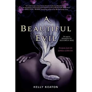
Snake Braids

My Thoughts:
Three's enough.
From here on out they'll look unoriginal. In fact they already look a tad unoriginal, don't you think? Sweet Venom was the first to be released also my favorite and then came A Beautiful Evil which use to look different. Shifting first used the stock image of ABE, but the model had dark hair. When the design team saw it was in use, they must have swapped it out for the cover you see above. I think Sweet Venom's concept is subtle and intriguing whereas the others just look... snakey.
Blood and Butterflies
My Thoughts:
Creepy.
Blood and Butterflies. That's just not the kind of image I come up with when I think butterfly...
Competing Covers
My Thoughts:
Diva wins.
The Lucky Ones is slightly SOL IMO. The dress is too modern, and the pose gives a romance novel feel. In fact I think there is a romance novel with this dress on it!
Here we go:
Here we go:
These books have been competing cover by cover, and all in all, Godbersen's covers win, however, this third installment is quite disappointing.
Even if the models on Larkin's covers look like plasticized Barbie dolls, which, they do, they get the costumes right every time.
The Colors of 2012 in Sequels:
Blues

*P.S.- Click the link to pre-order this one, I highly recommend you do!*
Reds

My Thoughts:
Is Helen really wearing the same dress from the Starcrossed cover?
I Leave You With This:
Possibly the most beautiful YA cover I've ever seen.


No comments:
Post a Comment